There are various methods to estimate the proportions of cell types in bulk RNA data. Since the actual cell proportions of the data are unknown, how do we know if our tools are producing accurate results?
In this tutorial we will be using single-cell data with known cell-type proportions in order to create pseudo-bulk RNA data. We will then estimate the cell-type proportions of this pseudo-bulk data using the currently available deconvolution tools within Galaxy. Since we know the true proportion values, we will be able to measure and compare the accuracy of the tools’ predictions.
Click galaxy-uploadUpload at the top of the activity panel
Select galaxy-wf-editPaste/Fetch Data
Paste the link(s) into the text field
Press Start
Close the window
As an alternative to uploading the data from a URL or your computer, the files may also have been made available from a shared data library:
Go into Libraries (left panel)
Navigate to the correct folder as indicated by your instructor.
On most Galaxies tutorial data will be provided in a folder named GTN - Material –> Topic Name -> Tutorial Name.
Select the desired files
Click on Add to Historygalaxy-dropdown near the top and select as Datasets from the dropdown menu
In the pop-up window, choose
“Select history”: the history you want to import the data to (or create a new one)
Click on Import
Check the datatypes are tabular
Click on the galaxy-pencilpencil icon for the dataset to edit its attributes
In the central panel, click galaxy-chart-select-dataDatatypes tab on the top
In the galaxy-chart-select-dataAssign Datatype, select tabular from “New Type” dropdown
Tip: you can start typing the datatype into the field to filter the dropdown menu
Click the Save button
Add a #metadata tag to EMTABesethealthy.phenotype.tabular and a #expression tag to EMTABesethealthy.expression.tabular
Datasets can be tagged. This simplifies the tracking of datasets across the Galaxy interface. Tags can contain any combination of letters or numbers but cannot contain spaces.
To tag a dataset:
Click on the dataset to expand it
Click on Add Tagsgalaxy-tags
Add tag text. Tags starting with # will be automatically propagated to the outputs of tools using this dataset (see below).
Press Enter
Check that the tag appears below the dataset name
Tags beginning with # are special!
They are called Name tags. The unique feature of these tags is that they propagate: if a dataset is labelled with a name tag, all derivatives (children) of this dataset will automatically inherit this tag (see below). The figure below explains why this is so useful. Consider the following analysis (numbers in parenthesis correspond to dataset numbers in the figure below):
a set of forward and reverse reads (datasets 1 and 2) is mapped against a reference using Bowtie2 generating dataset 3;
dataset 3 is used to calculate read coverage using BedTools Genome Coverageseparately for + and - strands. This generates two datasets (4 and 5 for plus and minus, respectively);
datasets 4 and 5 are used as inputs to Macs2 broadCall datasets generating datasets 6 and 8;
datasets 6 and 8 are intersected with coordinates of genes (dataset 9) using BedTools Intersect generating datasets 10 and 11.
Now consider that this analysis is done without name tags. This is shown on the left side of the figure. It is hard to trace which datasets contain “plus” data versus “minus” data. For example, does dataset 10 contain “plus” data or “minus” data? Probably “minus” but are you sure? In the case of a small history like the one shown here, it is possible to trace this manually but as the size of a history grows it will become very challenging.
The right side of the figure shows exactly the same analysis, but using name tags. When the analysis was conducted datasets 4 and 5 were tagged with #plus and #minus, respectively. When they were used as inputs to Macs2 resulting datasets 6 and 8 automatically inherited them and so on… As a result it is straightforward to trace both branches (plus and minus) of this analysis.
Before continuing lets quickly inspect our single-cell data. We can find all of the cell types present in the data alongside their proportions by using the count tool to count the occurrence of each cell type category in the metadata file.
“Count occurrences of values in column(s)”: Column 5
“Delimited by”: Tab
“How should the results be sorted?”: With the most common value first
Renamegalaxy-pencil output Cell type counts
Click on the galaxy-pencilpencil icon for the dataset to edit its attributes
In the central panel, change the Name field
Click the Save button
We can see from the output table below, there are various cell types present in the data. Note that many of the cell types have very low proportion values, this should be kept in mind later on as cell types that appear only a hand full of times (or even just once!) in the data may not be very useful and only add noise.
Cell Type
Count
alpha
443
beta
171
ductal
135
acinar
112
gamma
75
delta
59
unclassified endocrine
29
co-expression
26
PSC
23
endothelial
13
epsilon
5
mast
4
unclassified
1
MHC class II
1
Question: Inspecting the single-cell data
How many cells are in the single-cell data?
How many cell types are present in the data?
Inspecting the general information of EMTABesethealthy.expression.tabular we can see that there are 1,097 cells in the data as there are 1,098 columns (we need to subtract 1 for the header).
Looking at the output of the Count tool (or the above table), there are 14 distinct cell types in the data.
Process the single-cell data
In order to get a good understanding of the accuracy of our deconvolution tools, we are going to run our evaluations multiple times. This approach ensures that a single good or bad evaluation does not disproportionately represent the tool’s overall performance.
However, instead of running all of our tools multiple times for each evaluation (which would be quite time consuming!), we will leverage “batch computation” in Galaxy. By storing our data in collections, any tools or workflows that use those collections will automatically run multiple times (once for each element in the collection). We will now perform some pre-processing of our data to get it into the right format.
Transpose expression matrix
If we inspect the expression data file downloaded earlier, we can see that currently the rows represent genes and columns represent cells. However, this needs to be swapped for the later workflows. To fix this we will transpose the expression matrix.
Hands On: Transpose expression matrix
Transpose ( Galaxy version 1.8+galaxy1) with the following parameters:
For this tutorial we will run the evaluations 20 times, this will both help improve the sample size and allow us to determine the consistency of the tools, whilst being small enough to run in a reasonable amount of time.
We will now duplicate our single-cell data 20 times and store it in a collection. This will be done for both the expression data and metadata files.
Hands On: Generate collections from data
Duplicate file to collection with the following parameters:
We are now going to run our first workflow! This workflow will extract a subsample from the data containing 200 random cells. The workflow will then perform two things with this subsample:
Count the cell types and proportions of the data in order to be used as reference later against the predicted proportion values
Remove the cell types and convert the single-cell data into pseudo-bulk data to be later inputted into the deconvolution tools.
The above will be done twice to emulate multiple “subjects”. Since the deconvolution tools will be expecting the bulk-RNA data to comprise of at least 2 subjects (each with their own bulk data). For this tutorial our subjects will simply be called A and B. However, in the real world these subjects could be different patients, tissue samples, diseased/healthy, etc.
Comment: Different Results
Note that since we are selecting 20 samples, each containing 200 randomly selected cells. The plots and results presented in this tutorial will differ from your own. There will be some similarities such as certain cells being in higher proportion to others but the exact values with differ!
Remember since we have a collection of 20 inputs, the output of this workflow will be a collection of 20 elements, each corresponding to the input elements. Each output will have its own random selection of 200 cells.
Hands On: Run pseudo-bulk and actual proportions workflow
Import the workflow into Galaxy
Copy the URL (e.g. via right-click) of this workflow or download it to your computer.
Import the workflow into Galaxy
Run Workflow pseudobulk and actual proportionsworkflow using the following parameters:
param-collection“Metadata”: Metadata
param-collection“Expression Data”: Expression Data
Click on Workflows on the Activity Bar on the left.
At the top of the resulting page you will have the option to switch between the My workflows, Workflows shared with me and Public workflows tabs.
Select the tab you want to see all workflows in that category
Search for your desired workflow.
Click on the workflow name: a pop-up window opens with a preview of the workflow.
To run it directly: click Run (top-right).
Recommended: click Import (left of Run) to make your own local copy under Workflows / My Workflows.
Add a tag labelled #A to the first “Actual cell proportions” and “Pseudobulk” collections
Add a tag labelled #B to the second “Actual cell proportions” and “Pseudobulk” collections
The output of this workflow will be the psuedo-bulk and actual cell proportions for both samples A and B. If you inspect one of the elements in the Actual Cell Proportions collection, you should see a table similar to the following:
A_actual
acinar
0.090000
alpha
0.415000
beta
0.170000
co-expression
0.050000
delta
0.070000
ductal
0.105000
endothelial
0.015000
gamma
0.050000
mast
0.010000
unclassified endocrine
0.025000
Comparing the above table with the cell-type counts of the original single-cell data, does this look correct? Well the top 3 cell-types with the highest proportion in the single-cell data are: alpha, beta, ductal. Which aligns with the proportion values of the above data! There may be some variance due to the randomly selected cells. Also note that some of the lesser common cell types (like MHC class II) aren’t present in the above table, again this is due to the 200 randomly selected cells for this specific sample and isn’t of concern.
Perform deconvolution on the pseudo-bulk data
Now that we have our pseudo-bulk data alongside the actual proportion values. Our next step is to run deconvolution to get predicted cell-type proportions! Currently, Galaxy contains two tools for performing deconvolution: MuSiC and NNLS. We will use both of these tools in this tutorial and compare their results together.
Generate expression set objects
First we will need to use the single-cell data to build an expression set object, which will be used in the following workflow to perform deconvolution.
Note: We are using the original imported data here, not the transposed data or collections.
Hands On: Build the Expression Set object
Construct Expression Set Object ( Galaxy version 0.1.1+galaxy3) with the following parameters:
“Awk- actual header (A)”: BEGIN { print "A_actual\tcell_type" } { print $0 }
“Awk - infer header (A)”: BEGIN { print "0\tA_infer\t0" } NR > 1 {print $0 }
“Awk- actual header (B)”: BEGIN { print "B_actual\tcell_type" } { print $0 }
“Awk - infer header (B)”: BEGIN { print "0\tB_infer\t0" } NR > 1 {print $0 }
Comment
An ExpressionSet object has many data slots, the principle of which are the experiment data (exprs), the phenotype data (pData), as well metadata pertaining to experiment information and additional annotations (fData).
Similar to the expression data, this ExpressionSet object needs to be duplicated 20 times into a collection for later batch processing.
Hands On: Generate ESet collection
Duplicate file to collection with the following parameters:
param-file“Input Dataset”: RData ESet Object (output of Construct Expression Set Objecttool)
“Size of output colection”: 20
Renamegalaxy-pencil output ESet Object
Run the Workflow
The following workflow will take the two pseudo-bulk samples (A and B), as well as the original single-cell data as reference and output the deconvolution results for both samples and deconvolution methods. Thus producing 4 output collections. The pdf results of the deconvolution tools will also be outputted from the workflow but won’t be needed for the tutorial.
Hands On: Run inferring cellular proportions workflow
Import the workflow into Galaxy
Copy the URL (e.g. via right-click) of this workflow or download it to your computer.
Import the workflow into Galaxy
Run Workflow inferring cellular proportionsworkflow using the following parameters:
param-collection“Pseudobulk - A”: Pseudobulk (#A)
param-collection“Pseudobulk - B”: Pseudobulk (#B)
param-collection“ESet Reference scRNA-seq”: ESet Object
“Cell Types Label from scRNA dataset”: cellType
“Samples Identifier from scRNA dataset”: sampleID
“Cell types to use from scRNA dataset”:alpha,beta,ductal,acinar,gamma,delta,unclassified endocrine,co-expression,PSC,endothelial,epsilon,mast,unclassified,MHC class II
param-collection“Actual - B”: Actual cell proportions (#B)
param-collection“Actual - A”: Actual cell proportions (#A)
Click on Workflows on the Activity Bar on the left.
At the top of the resulting page you will have the option to switch between the My workflows, Workflows shared with me and Public workflows tabs.
Select the tab you want to see all workflows in that category
Search for your desired workflow.
Click on the workflow name: a pop-up window opens with a preview of the workflow.
To run it directly: click Run (top-right).
Recommended: click Import (left of Run) to make your own local copy under Workflows / My Workflows.
Visualise results
Now that we have our deconvolution results, the next step is to analyse the predictions and determine how accurate our tools are given our reference data. Since our pseudo-subjects A and B come from the same data, there isn’t much point inspecting them both. So for the rest of the tutorial we will just focus our analysis on subject A.
In order to determine if our tools have produced accurate results, we will create various plots and compute different metrics to visualise and quantify the outputs of our tools.
Pre-process the output results
Before visualising or inspecting the outputs of the deconvolution tools, we first need to perform some pre-processing. Up until now we have been working with collections in order to perform our evaluations multiple times in parallel. However, for analysing our data, collections will be a bit messy and are no longer needed. The following workflow will combine all the collections of the MuSiC and NNLS outputs into two tables:
A results table presenting the predicted and actual proportion values of each cell-type of each subsample
An error table showing the difference between the actual and predicted values. Which will be needed for a later plot.
Hands On: Run visualisation pre-processing workflow
Import the workflow into Galaxy
Copy the URL (e.g. via right-click) of this workflow or download it to your computer.
Import the workflow into Galaxy
Run Workflow preprocess visualisationsworkflow using the following parameters:
param-collection“Cell Proportions”: A - Music Results
Run Workflow preprocess visualisationsworkflow using the following parameters:
param-collection“Cell Proportions”: B - NNLS Results
Click on Workflows on the Activity Bar on the left.
At the top of the resulting page you will have the option to switch between the My workflows, Workflows shared with me and Public workflows tabs.
Select the tab you want to see all workflows in that category
Search for your desired workflow.
Click on the workflow name: a pop-up window opens with a preview of the workflow.
To run it directly: click Run (top-right).
Recommended: click Import (left of Run) to make your own local copy under Workflows / My Workflows.
The following table shows a snippet of the Results Table for the MuSiC tool. A header has been added for better reading but has been omitted in the workflow output as it will interfere with the visualisation tools.
Cell Type
Actual Proportion
Predicted Proportion
acinar
0.090000
0.0814442584577275
alpha
0.415000
0.427718807911522
beta
0.170000
0.256954867012044
co-expression
0.050000
0
delta
0.070000
0.0929840465107452
…
…
…
Already at first glance we can see some interesting results! Firstly we can see that the tool is able to make predictions close to the actual values such as with acinar, alpha, delta. We also see the tool failing to make any type of prediction for co-expression cells with a predicted proportion value of 0. This however isn’t a compete surprise since co-expression cells are of small proportion in the bulk and reference data.
But this is only a small sample of the results. Lets create some visualisations to see the whole picture!
Plot scatter plots of the results
The first type of visualisation we will do is a scatter plot. This plot will compare the actual and predicted proportion values for each cell across each subsample. We will also colour each point on the plot to indicate which cell type it belongs to. Let’s do that now for both the MuSiC and NNLS results.
Expand one of the output datasets of the tool (by clicking on it)
Click re-run galaxy-refresh the tool
This is useful if you want to run the tool again but with slightly different paramters, or if you just want to check which parameter setting you used.
Hands On: Plot the actual and inferred data
Scatterplot with ggplot2 ( Galaxy version 3.4.0+galaxy1) with the following parameters:
param-file“Input in tabular format”: Results Table (Music)
“Column to plot on x-axis”: 2
“Column to plot on y-axis”: 3
“Plot title”: Correlation between inferred and actual cell-type proportions
“Label for x axis”: Actual proportions
“Label for y axis”: Inferred proportions
In “Advanced options”:
“Plotting multiple groups”: Plot multiple groups of data on one plot
“column differentiating the different groups”: 1
“Color schemes to differentiate your groups”: Paired - predefined color pallete (discrete, max=12 colors)
“Reverse color scheme”: Default order of color scheme
In “Output options”:
“width of output”: 6.0
“height of output”: 4.0
Renamegalaxy-pencil output Scatter plot - Music
Add a #plot tag to Scatter plot - Music
Scatterplot with ggplot2 ( Galaxy version 3.4.0+galaxy1) with the following parameters:
param-file“Input in tabular format”: Results Table (NNLS)
“Column to plot on x-axis”: 2
“Column to plot on y-axis”: 3
“Plot title”: Correlation between inferred and actual cell-type proportions
“Label for x axis”: Actual proportions
“Label for y axis”: Inferred proportions
In “Advanced options”:
“Plotting multiple groups”: Plot multiple groups of data on one plot
“column differentiating the different groups”: 1
“Color schemes to differentiate your groups”: Paired - predefined color pallete (discrete, max=12 colors)
“Reverse color scheme”: Default order of color scheme
In “Output options”:
“width of output”: 6.0
“height of output”: 4.0
Renamegalaxy-pencil output Scatter plot - NNLS
Add a #plot tag to Scatter plot - NNLS
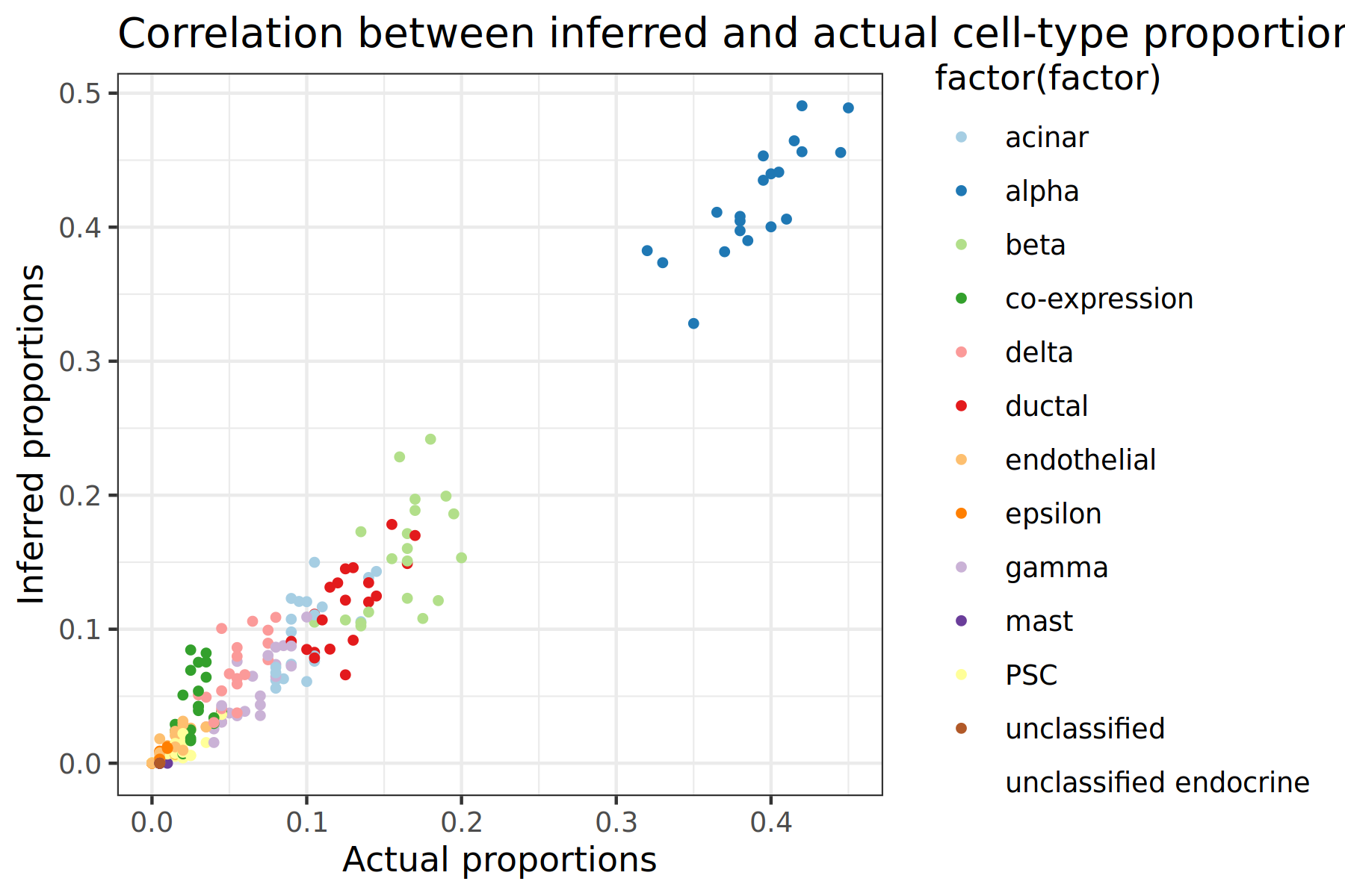
The output of this tool should produce two scatter plots that looks like the image below. Each point on the plot represents a cell-type for a specific subsample, so there should be 20 points of each colour (one for each subsample created earlier). Since we are comparing the actual and inferred proportions, the ideal scatter plot would have all of the points be at the y=x line. The further the deviations are from this ideal line, the less accurate the tool is. We can also use this plot to determine if the tool is under or over predicting proportion values for each cell-type, or if the tool is struggling to predict certain cell types.
Figure 2: Scatter plot comparison between Music and NNLS
Comparing scatter plots, the MuSiC tool has the most accurate results since the points fall closer onto the x=y line
Both scatter plots show alpha cells having the highest proportion by a large margin
The MuSiC tool seems to handle all cell types well. However, NNLS appears to struggle predicting the proportions of beta cells, with many of the samples being predicted as having a proportion of 0
Plot violin plots of the errors
Next we will plot the distribution of errors between the predicted and actual cellular proportions for a select number of cell types. We could plot all cell types in the output, however too many will cause the visualisations to be messy and difficult to interpret.
We can use the cell-type counts we computed at the beginning of the tutorial to determine the best cell types to use. We will use the top 5 most abundant cell types in the single-cell data being: alpha, beta, gamma, ductal, acinar. Before plotting we will extract only these cell types from our table of errors.
Expand one of the output datasets of the tool (by clicking on it)
Click re-run galaxy-refresh the tool
This is useful if you want to run the tool again but with slightly different paramters, or if you just want to check which parameter setting you used.
Hands On: Extract Cell Types
Advanced Cut ( Galaxy version 9.3+galaxy2) with the following parameters:
param-file“File to cut”: Error Table (Music)
“Operation”: Keep
“Cut by”: fields
“Delimited by”: Tab
“Is there a header for the data’s columns ?”: Yes
“List of Fields”: Select the columns containing: alpha, beta, gamma, ductal, acinar
Renamegalaxy-pencil output Music Errors
Advanced Cut ( Galaxy version 9.3+galaxy2) with the following parameters:
param-file“File to cut”: Error Table (NNLS)
“Operation”: Keep
“Cut by”: fields
“Delimited by”: Tab
“Is there a header for the data’s columns ?”: Yes
“List of Fields”: Select the columns containing: alpha, beta, gamma, ductal, acinar
Renamegalaxy-pencil output NNLS Errors
Now we have our table of errors consisting of only the top 5 cell-types, we can plot the violin plots.
Expand one of the output datasets of the tool (by clicking on it)
Click re-run galaxy-refresh the tool
This is useful if you want to run the tool again but with slightly different paramters, or if you just want to check which parameter setting you used.
Hands On: Plot violin plots
Violin plot w ggplot2 ( Galaxy version 3.4.0+galaxy1) with the following parameters:
param-file“Input in tabular format”: Music Errors
“Plot title”: Error Distribution
“Label for x axis”: Cell Type
“Label for y axis”: Difference Error
In “Advanced Options”:
“Violin border options”: Purple
In “Output Options”:
“width of output”: 3.0
“height of output”: 2.0
Renamegalaxy-pencil output Violin Plot - Music
Add a #plot tag to Violin Plot - Music
Violin plot w ggplot2 ( Galaxy version 3.4.0+galaxy1) with the following parameters:
param-file“Input in tabular format”: NNLS Errors
“Plot title”: Error Distribution
“Label for x axis”: Cell Type
“Label for y axis”: Difference Error
In “Advanced Options”:
“Violin border options”: Purple
In “Output Options”:
“width of output”: 3.0
“height of output”: 2.0
Renamegalaxy-pencil output Violin Plot - NNLS
Add a #plot tag to Violin Plot - NNLS
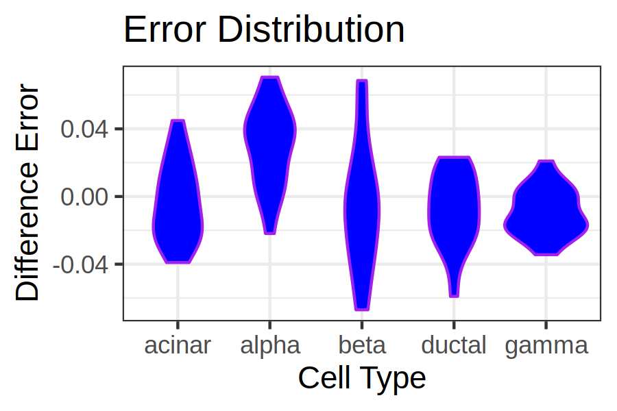
The output of this tool will be two violin plots that will look similar to the below image. Here we can see the distribution of errors for each cell type. Since we are using normal errors and not absolute or squared errors, we are also able to see whether the tool has under or over estimated the cell type. An ideal plot would have all the violin plots being short in height and close to 0 indicating that the estimated and actual values are close together (resulting in an error close to 0).
Figure 4: Scatter plot comparison between Music and NNLS
Comparing the two violin plots, MuSiC has the better error results, with more samples closer to zero. Inspecting the y-axis of the plots also show that the MuSiC errors span a smaller range compared to NNLS.
MuSiC can be seen as having the most balanced results with the bulk of the estimates being around 0. Whereas the NNLS results show large amounts of both overestimation and underestimation of various cell types.
From the NNLS violin plot it can be seen that ductal cells are greatly overestimated.
Compute accuracy metrics
Visualisations are a great tool for getting an intuitive overview of the data. However, some of the interpretations from visualisations can be subjective. Having quantitative results alongside visualisations can offer concrete and precise values about the data that can more easily be compared. We will use two different quantitative metrics in this tutorial; Pearson correlation and RMSE.
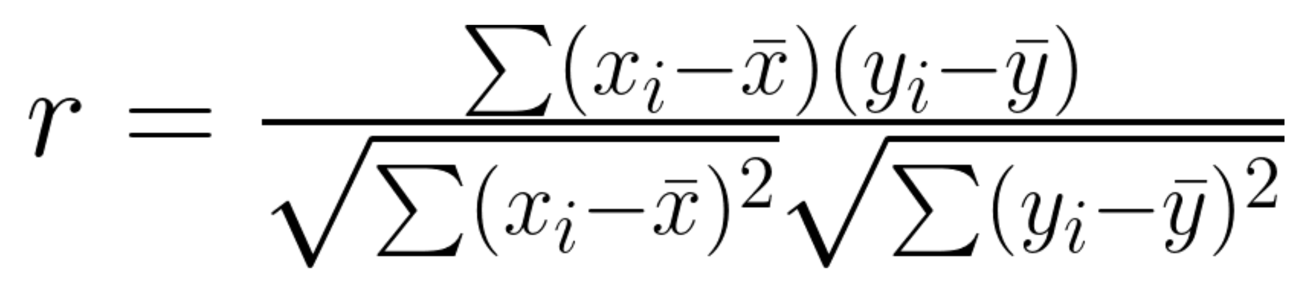
Pearson Correlation
The Pearson correlation coefficient is a statistical value that represents the direction and correlation between two variables, the value of this metric ranges between -1 and 1, where:
-1 = negative correlation
0 = no correlation
1 = positive correlation
The equation for calculating the Pearson correlation can be seen below, the workflow to compute this metric breaks down this formula into smaller steps.
Root Mean Squared Error or RMSE is a common metric for measuring a tools prediction error. This metric calculates the average error between the predicted and actual values for each prediction then takes the mean and square root of the error to produce a final value. Lower RMSE values (close to 0) indicate accurate predictions similar to the actual value, as the value increases the accuracy score worsens.
The equation for calculating this metric is seen below, the implementation of this calculation is in the workflow alongside the Pearson correlation.
With a basic understanding of some useful metrics, we will now compute these to get quantitative values alongside our visualisation results. The following workflow needs to be run for both the MuSiC and NNLS results table.
Hands On: Run metrics workflow
Import the workflow into Galaxy
Copy the URL (e.g. via right-click) of this workflow or download it to your computer.
Import the workflow into Galaxy
Run Workflow compute metricsworkflow using the following parameters:
Click on Workflows on the Activity Bar on the left.
At the top of the resulting page you will have the option to switch between the My workflows, Workflows shared with me and Public workflows tabs.
Select the tab you want to see all workflows in that category
Search for your desired workflow.
Click on the workflow name: a pop-up window opens with a preview of the workflow.
To run it directly: click Run (top-right).
Recommended: click Import (left of Run) to make your own local copy under Workflows / My Workflows.
After running the workflow on both the MuSiC and NNLS results we should have the Pearson and RMSE metrics for both tools in various outputs. Below combines these metrics into a single summary table.
Tool
Pearson Correlation
RMSE
MuSiC
0.982
0.022
NNLS
0.778
0.678
From the table we can now see concrete values representing the error and correlation between the predictions and actual proportion values. We can see from the table that the MuSiC tool has a much better accuracy with a higher correlation score and lower error compared to NNLS.
The conclusions to draw from this analysis, is that our reference data is effective for use in deconvolution analysis since both tools were able to have high accuracy and low error scores. We also determined that (for at least this data) the MuSiC tool was the more effective/accurate tool and thus would likely be the more trustworthy when performing deconvolution with this single-cell reference data.
Conclusion
congratulations Congratulations! You made it to the end of the tutorial!
In this tutorial we took some single-cell data with known cell-type proportions, subsampled the data, and converted them to pseudo-bulk data. We then used this pseudo-bulk data to perform deconvolution using the two tools available in Galaxy: MuSiC and NNLS. Using the known cell-type proportions we were able to analyse the predicted proportions to the ground truth in order to determine if the reference data can be used and which tool is the most effective. We used various visualisation and statistical techniques to analyse and quantify the tools accuracy, reliability, and error.
You've Finished the Tutorial
Please also consider filling out the Feedback Form as well!
Key points
It is important to validate the accuracy of both deconvolution tools and reference data
There are various visualisation and quantative methods of analysing results
Different deconvolution tools have varying accuracy, comparing them against the same reference is a useful test to determine the best tool for your data
Frequently Asked Questions
Have questions about this tutorial? Have a look at the available FAQ pages and support channels
Further information, including links to documentation and original publications, regarding the tools, analysis techniques and the interpretation of results described in this tutorial can be found here.
Feedback
Did you use this material as an instructor? Feel free to give us feedback on how it went.
Did you use this material as a learner or student? Click the form below to leave feedback.
Hiltemann, Saskia, Rasche, Helena et al., 2023 Galaxy Training: A Powerful Framework for Teaching! PLOS Computational Biology 10.1371/journal.pcbi.1010752
Batut et al., 2018 Community-Driven Data Analysis Training for Biology Cell Systems 10.1016/j.cels.2018.05.012
@misc{single-cell-bulk-deconvolution-evaluate,
author = "Morgan Howells",
	title = "Evaluating Reference Data for Bulk RNA Deconvolution (Galaxy Training Materials)",
	year = "",
	month = "",
	day = "",
	url = "\url{https://training.galaxyproject.org/training-material/topics/single-cell/tutorials/bulk-deconvolution-evaluate/tutorial.html}",
	note = "[Online; accessed TODAY]"
}
@article{Hiltemann_2023,
	doi = {10.1371/journal.pcbi.1010752},
	url = {https://doi.org/10.1371%2Fjournal.pcbi.1010752},
	year = 2023,
	month = {jan},
	publisher = {Public Library of Science ({PLoS})},
	volume = {19},
	number = {1},
	pages = {e1010752},
	author = {Saskia Hiltemann and Helena Rasche and Simon Gladman and Hans-Rudolf Hotz and Delphine Larivi{\`{e}}re and Daniel Blankenberg and Pratik D. Jagtap and Thomas Wollmann and Anthony Bretaudeau and Nadia Gou{\'{e}} and Timothy J. Griffin and Coline Royaux and Yvan Le Bras and Subina Mehta and Anna Syme and Frederik Coppens and Bert Droesbeke and Nicola Soranzo and Wendi Bacon and Fotis Psomopoulos and Crist{\'{o}}bal Gallardo-Alba and John Davis and Melanie Christine Föll and Matthias Fahrner and Maria A. Doyle and Beatriz Serrano-Solano and Anne Claire Fouilloux and Peter van Heusden and Wolfgang Maier and Dave Clements and Florian Heyl and Björn Grüning and B{\'{e}}r{\'{e}}nice Batut and},
	editor = {Francis Ouellette},
	title = {Galaxy Training: A powerful framework for teaching!},
	journal = {PLoS Comput Biol}
}
Funding
These individuals or organisations provided funding support for the development of this resource
Questions:


 Open image in new tab
Open image in new tab
 Open image in new tab
Open image in new tab
 Open image in new tab
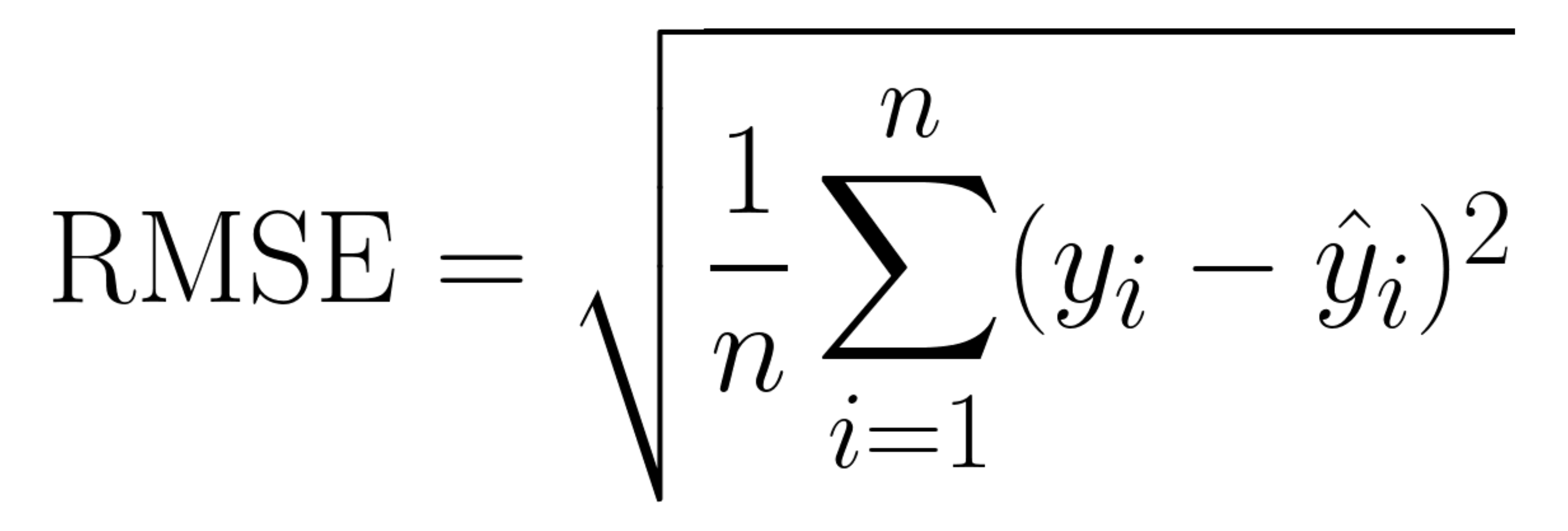 Open image in new tab