name: inverse layout: true class: center, middle, inverse <div class="my-header"><span> <a href="/training-material/topics/visualisation" title="Return to topic page" ><i class="fa fa-level-up" aria-hidden="true"></i></a> <a href="https://github.com/galaxyproject/training-material/edit/main/topics/visualisation/tutorials/introduction/slides.html"><i class="fa fa-pencil" aria-hidden="true"></i></a> </span></div> <div class="my-footer"><span> <img src="/training-material/assets/images/GTN-60px.png" alt="Galaxy Training Network" style="height: 40px;"/> </span></div> --- <img src="/training-material/assets/images/GTNLogo1000.png" alt="Galaxy Training Network" class="cover-logo"/> <br/> <br/> # Visualisations in Galaxy <br/> <br/> <div markdown="0"> <div class="contributors-line"> <ul class="text-list"> <li> <a href="/training-material/hall-of-fame/hexylena/" class="contributor-badge contributor-hexylena"><img src="/training-material/assets/images/orcid.png" alt="orcid logo" width="36" height="36"/><img src="https://avatars.githubusercontent.com/hexylena?s=36" alt="Helena Rasche avatar" width="36" class="avatar" /> Helena Rasche</a> <li> <a href="/training-material/hall-of-fame/shiltemann/" class="contributor-badge contributor-shiltemann"><img src="/training-material/assets/images/orcid.png" alt="orcid logo" width="36" height="36"/><img src="https://avatars.githubusercontent.com/shiltemann?s=36" alt="Saskia Hiltemann avatar" width="36" class="avatar" /> Saskia Hiltemann</a></li> </ul> </div> </div> <!-- modified date --> <div class="footnote" style="bottom: 8em;"> <i class="far fa-calendar" aria-hidden="true"></i><span class="visually-hidden">last_modification</span> Updated: <i class="fas fa-fingerprint" aria-hidden="true"></i><span class="visually-hidden">purl</span><abbr title="Persistent URL">PURL</abbr>: <a href="https://gxy.io/GTN:S00101">gxy.io/GTN:S00101</a> </div> <!-- other slide formats (video and plain-text) --> <div class="footnote" style="bottom: 5em;"> <i class="fas fa-file-alt" aria-hidden="true"></i><span class="visually-hidden">text-document</span><a href="slides-plain.html"> Plain-text slides</a> | </div> <!-- usage tips --> <div class="footnote" style="bottom: 2em;"> <strong>Tip: </strong>press <kbd>P</kbd> to view the presenter notes | <i class="fa fa-arrows" aria-hidden="true"></i><span class="visually-hidden">arrow-keys</span> Use arrow keys to move between slides </div> ??? Presenter notes contain extra information which might be useful if you intend to use these slides for teaching. Press `P` again to switch presenter notes off Press `C` to create a new window where the same presentation will be displayed. This window is linked to the main window. Changing slides on one will cause the slide to change on the other. Useful when presenting. --- # What is Data Visualisation - Making graphics to clearly convey data - Many different options 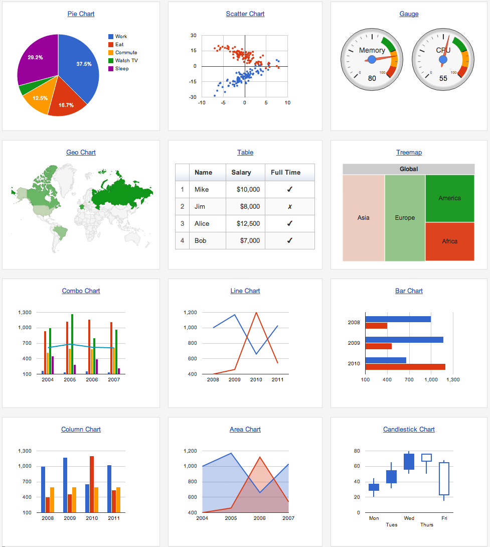 --- # What is Data Visualisation - More than just scatter plots and bar charts - Many domain-specific - Protein folding, network graphs, trees, genome browsers 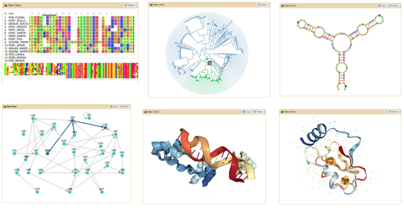 --- ## Why visualizations? .pull-left[ - *"A picture is worth 1000 words"* - Anscombe's Quartet - All these datasets share the same basic statistics: ```python X mean: 54.26, X SD: 16.76 Y mean: 47.83, Y SD: 26.93 Correlation: -0.06 ``` - But visualisation reveals vastly different underlying structures! ] .pull-right[ .image-90[] ] ??? Anscombes quartet, all these datasets have same mean, standard deviation and correlation, yet when visualizing them it is revealed they have vastly different structures. --- ## Data Visualisation in Galaxy --- ## Genome Browsers - Visualize the genome - mapped sequence reads, variants, genes, .. 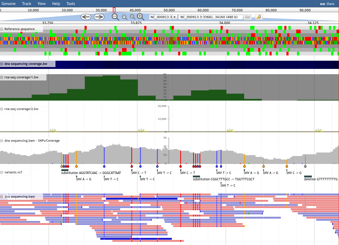 --- ## Genome Browsers in Galaxy - As display applications - e.g. UCSC browser, IBV, IGB, .. - accessed via links on dataset 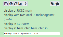 --- ## JBrowse - Genome browser as a regular tool - Configure your settings .image-75[ 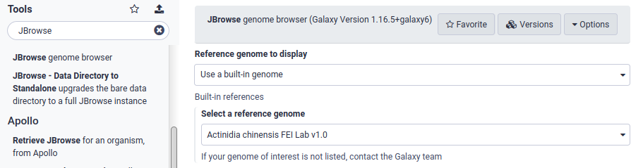 ] ??? - JBrowse is not a display application like the previous examples - Regular Galaxy tool --- ## JBrowse - Then interactively explore your genome .image-75[] --- ## Galaxy Charts - Accessed through Charts icon <i class="fas fa-chart-column" aria-hidden="true"></i><span class="visually-hidden">galaxy-barchart</span> on dataset - Different options depending on datatype 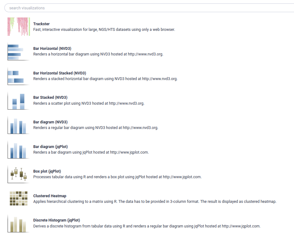 --- ## Galaxy Charts - After selecting chart type, can customize settings - Example: Protein Viewer 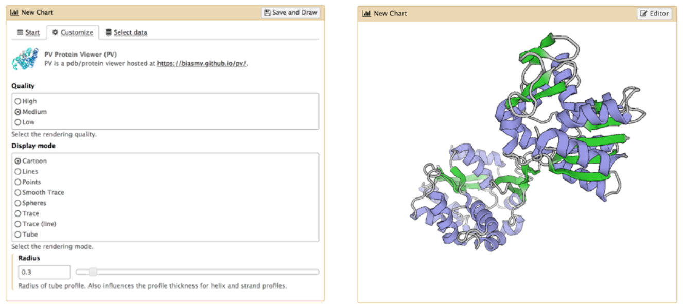 --- ## Visualisation Tools - Many tools for visualisation - Example: Circos for circular data plots 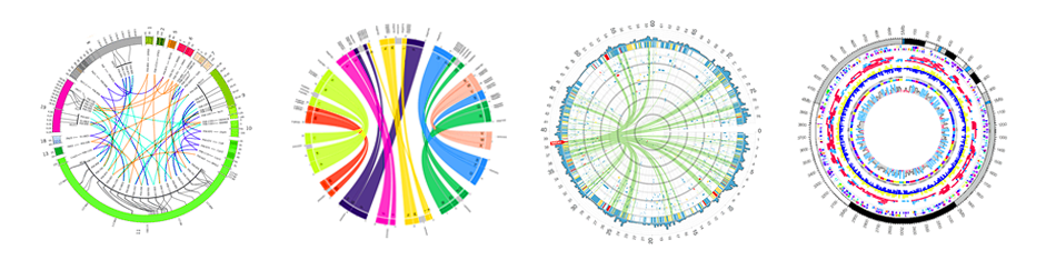 --- ## Related tutorials --- ## Thank You! This material is the result of a collaborative work. Thanks to the [Galaxy Training Network](https://training.galaxyproject.org) and all the contributors! <div markdown="0"> <div class="contributors-line"> <table class="contributions"> <tr> <td><abbr title="These people wrote the bulk of the tutorial, they may have done the analysis, built the workflow, and wrote the text themselves.">Author(s)</abbr></td> <td> <a href="/training-material/hall-of-fame/hexylena/" class="contributor-badge contributor-hexylena"><img src="/training-material/assets/images/orcid.png" alt="orcid logo" width="36" height="36"/><img src="https://avatars.githubusercontent.com/hexylena?s=36" alt="Helena Rasche avatar" width="36" class="avatar" /> Helena Rasche</a><a href="/training-material/hall-of-fame/shiltemann/" class="contributor-badge contributor-shiltemann"><img src="/training-material/assets/images/orcid.png" alt="orcid logo" width="36" height="36"/><img src="https://avatars.githubusercontent.com/shiltemann?s=36" alt="Saskia Hiltemann avatar" width="36" class="avatar" /> Saskia Hiltemann</a> </td> </tr> <tr class="reviewers"> <td><abbr title="These people reviewed this material for accuracy and correctness">Reviewers</abbr></td> <td> <a href="/training-material/hall-of-fame/bebatut/" class="contributor-badge contributor-badge-small contributor-bebatut"><img src="https://avatars.githubusercontent.com/bebatut?s=36" alt="Bérénice Batut avatar" width="36" class="avatar" /></a><a href="/training-material/hall-of-fame/abretaud/" class="contributor-badge contributor-badge-small contributor-abretaud"><img src="https://avatars.githubusercontent.com/abretaud?s=36" alt="Anthony Bretaudeau avatar" width="36" class="avatar" /></a><a href="/training-material/hall-of-fame/hexylena/" class="contributor-badge contributor-badge-small contributor-hexylena"><img src="https://avatars.githubusercontent.com/hexylena?s=36" alt="Helena Rasche avatar" width="36" class="avatar" /></a><a href="/training-material/hall-of-fame/bgruening/" class="contributor-badge contributor-badge-small contributor-bgruening"><img src="https://avatars.githubusercontent.com/bgruening?s=36" alt="Björn Grüning avatar" width="36" class="avatar" /></a><a href="/training-material/hall-of-fame/shiltemann/" class="contributor-badge contributor-badge-small contributor-shiltemann"><img src="https://avatars.githubusercontent.com/shiltemann?s=36" alt="Saskia Hiltemann avatar" width="36" class="avatar" /></a><a href="/training-material/hall-of-fame/gallardoalba/" class="contributor-badge contributor-badge-small contributor-gallardoalba"><img src="https://avatars.githubusercontent.com/gallardoalba?s=36" alt="Cristóbal Gallardo avatar" width="36" class="avatar" /></a></td> </tr> </table> </div> </div> <div style="display: flex;flex-direction: row;align-items: center;justify-content: center;"> <img src="/training-material/assets/images/GTNLogo1000.png" alt="Galaxy Training Network" style="height: 100px;"/> </div> Tutorial Content is licensed under <a rel="license" href="http://creativecommons.org/licenses/by/4.0/">Creative Commons Attribution 4.0 International License</a>.<br/>